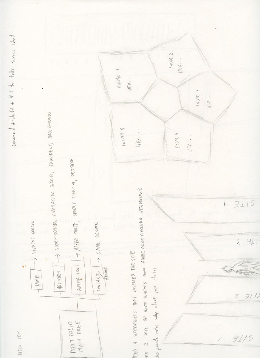
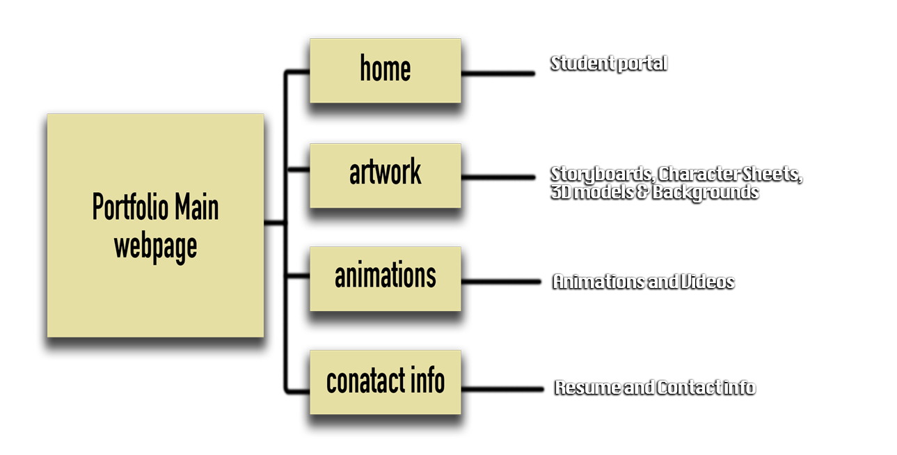
For my portfolio page I wanted to of course show off my work, but also do it in a way that was easy to navigate and walk through for anyone. Because while I do like good content on a website I want to be able to find what I’m looking for as quickly and easily as possible. For this I have a relatively simple key map for my website that leads to four main areas of expertise I want to focus on, as well as a way to contact me. I am usually inspired by dark websites with black backgrounds but for a student portal I figured I should use a lighter color scheme where things contrast and compliment each other.
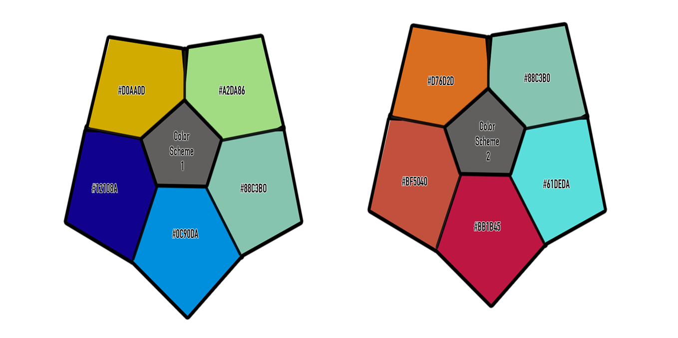
As for the color scheme itself I wanted distinct colors, ones that could express emotions and be attractive but at the same time Not take attention away from the content of the website. Red is warm and full of energy, while blue is calm and relaxing, each one makes an excellent basic for a full color scheme
For website inspiration I chose four websites that I really enjoy visiting that have designs that to me are easy to navigate. All of the main pages are on the top of the first page you get to. With the newest or most popular videos and images in the center meaning that’s what they want you to focus on. Also I really enjoy the hover effects when I swipe my mouse over an icon, so I’m going to definetly have fun experimenting with that.
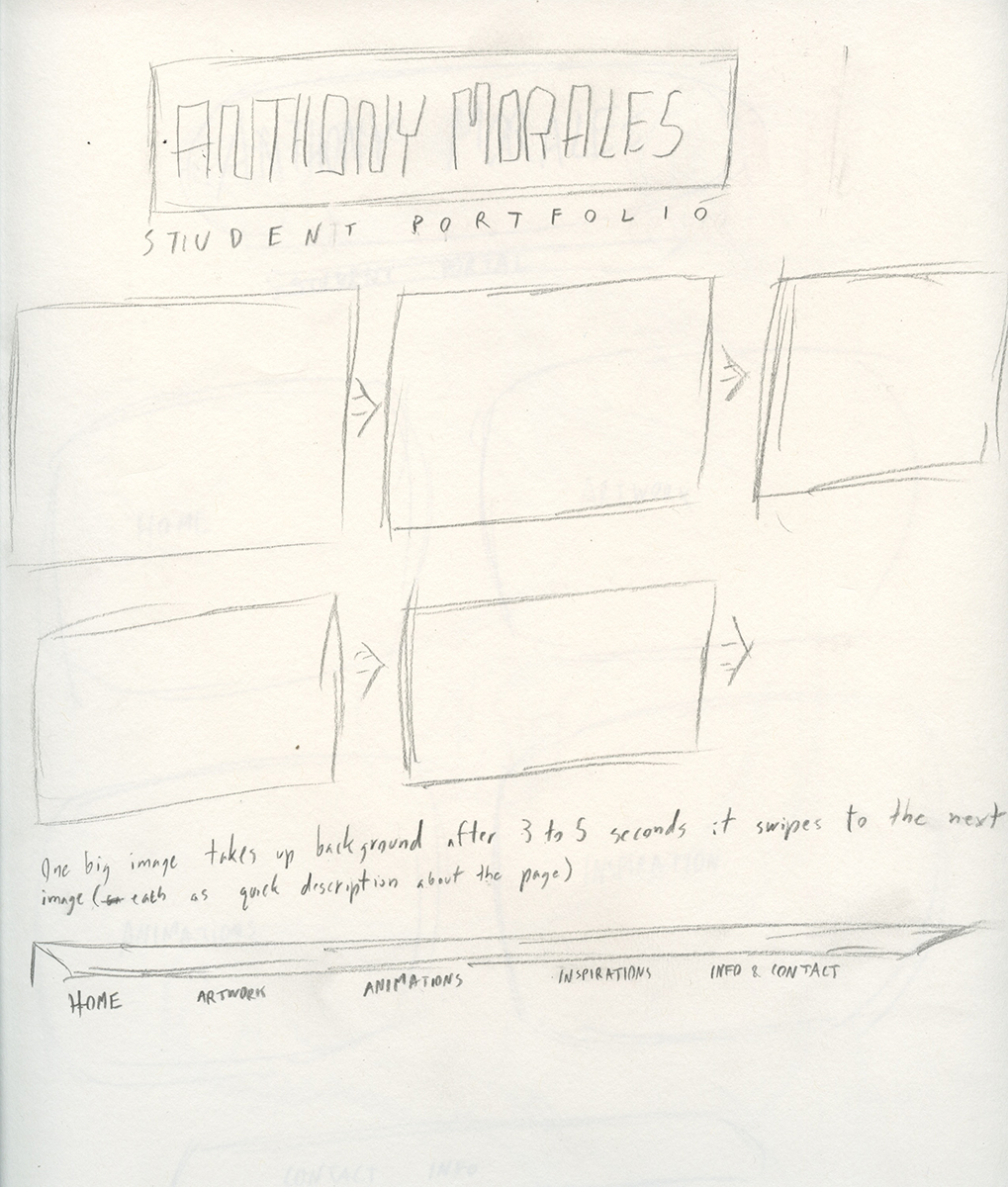
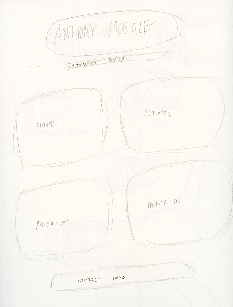
And lastly here are some early concept sketches I made to narrow down the field of what kind of format I wanted for my the site. All were good but it's clear that I was leaning towards a certain kind.
