Goals & Audience
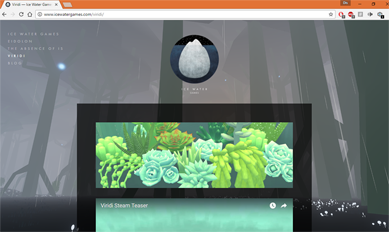
Goals of website, audience, foresee design, inspiration and influence My goal for this website is to be easily navigated and display my artwork in a fun way. I really want to use a website that is closely modeled after Ice Water Games website, Viridi, because it was so well received in class. Their website is very clean and organized in a way that the viewer doesn’t loss interest. There is a nice arrangement of videos, images, and quotes that is would like to use as a way to arrange at least my home page.
inspiration
VIRIDI
This one is my favorite. It is very clean and has all the games info on one page, with a nice mix of videos, reviews, and screen shots of game play. I like that nothing looks out of place and that the background isn’t overwhelming but also isn’t a pattern. The nav bar is off to the side but not hard to see.design spiration
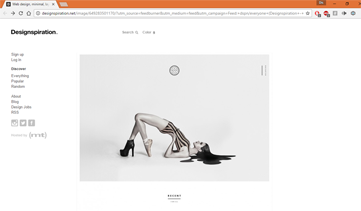
I liked this one because it was clean and simple; it was also monochromatic. it didn’t have to many images stacking next to each other.Star fighter
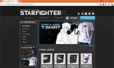
I liked this one because although it had a lot happening on it was busy. it also had the images at the top roll past and change every couple of seconds. I liked how the links where set up so that it linked you to groups of an item instead of singular objects.fire watch
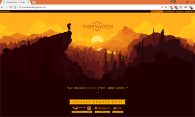
I like this one for its use of BG only at the top, and how it pulls you into the site. It also keeps a very simple color pallet.color palettes
layout ideas
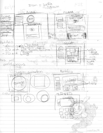
site map

