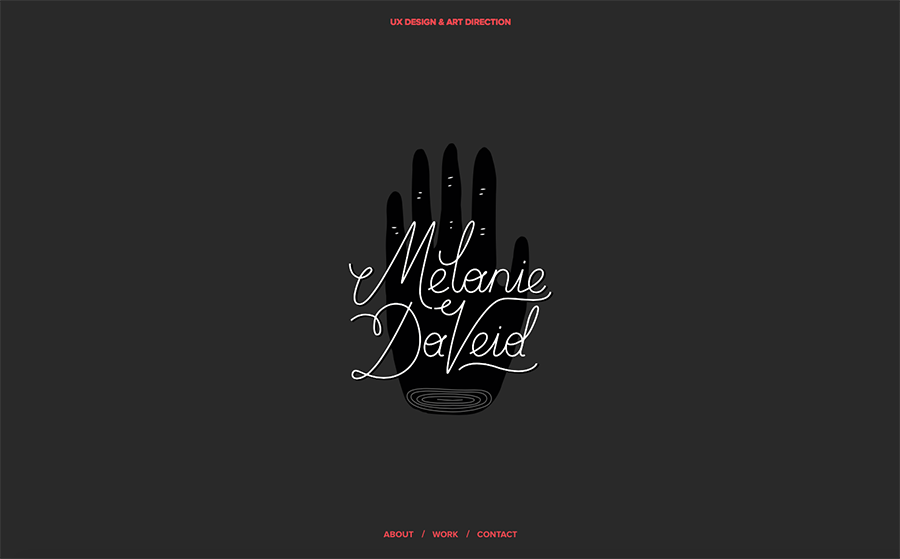
www.melaniedaveid.com
I came across Melanie DaVeid website and liked the way she stylizied and animated her name when you first enter her page
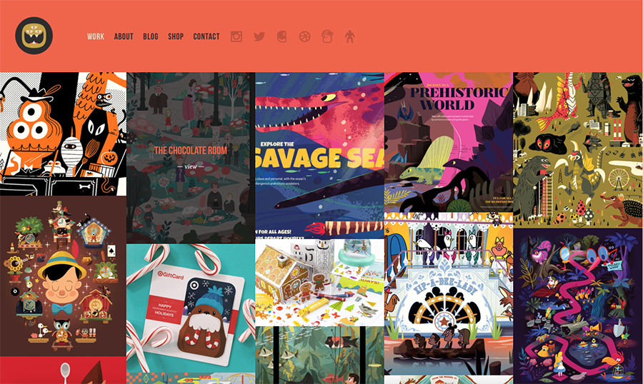
www.thebeastisback.com
I like the set up for images(my work this way could be interesting). I also liked how thebeastisback made his navbar to be seen at all times.
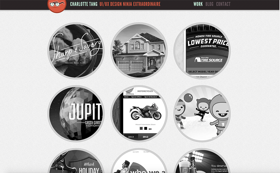
www.charlottetang.com From Charlottetang website I liked the way the images are black and white but when you roll over them they turn into color images.
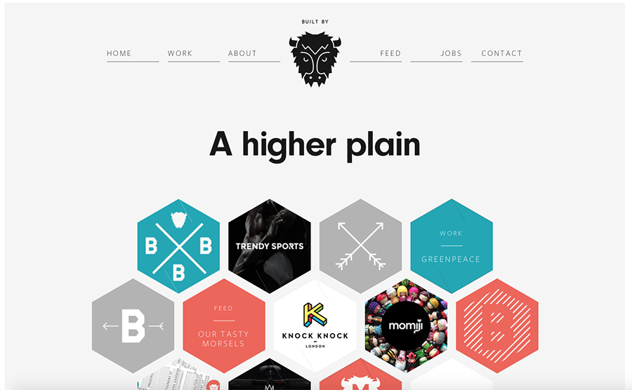
www.builtbybuffalo.com I really liked how builtbybuffalo website had interesting geometric shapes for his imagery. I also liked how his navbar is clean and simple with his logo in the middle.
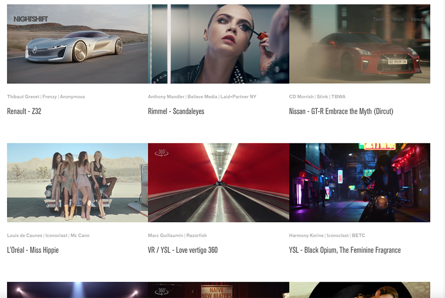
www.nightshiftpost.com I liked how nightshift's images turn into videos or move when you hover over them. I'm not sure what I can use for inspiration for my website yet.
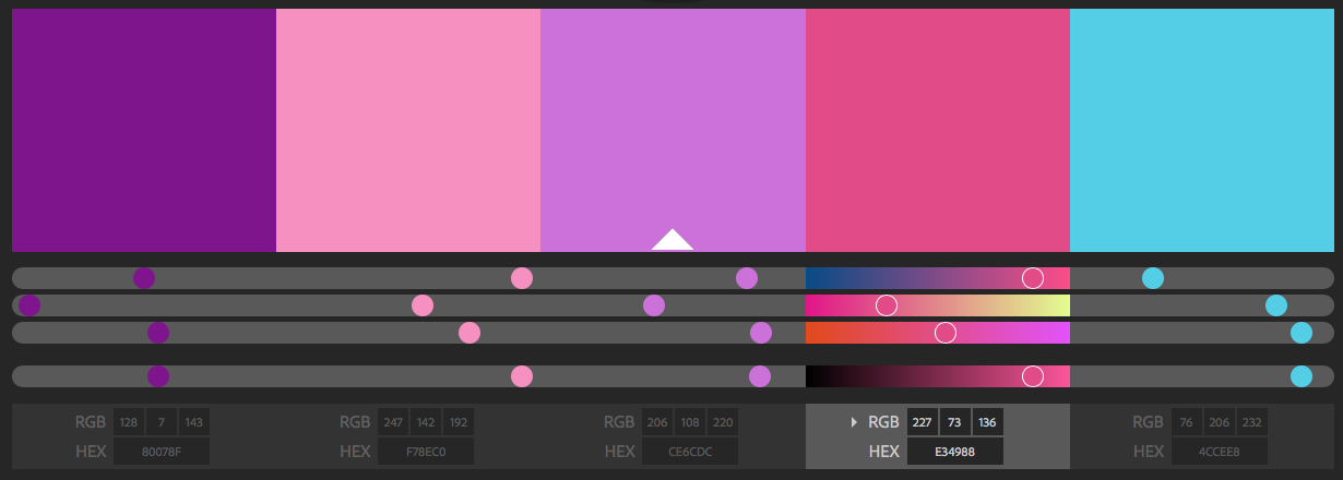
Color Palette:

Layout Drawing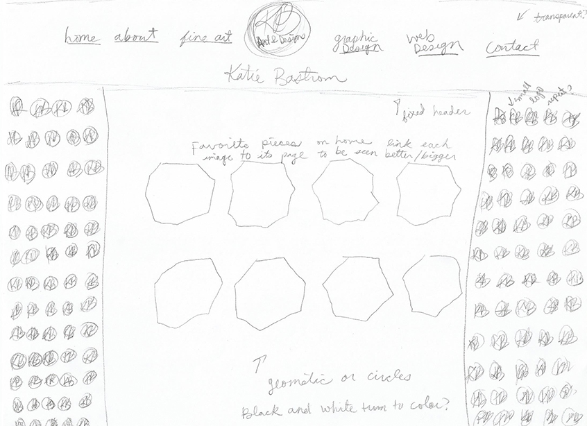

 Katie Bastrom