GOAL
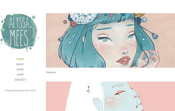
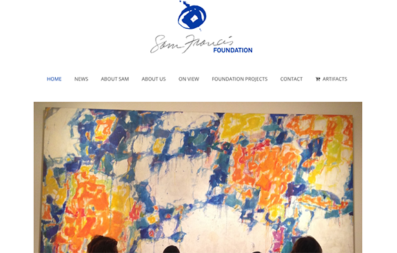
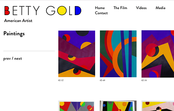
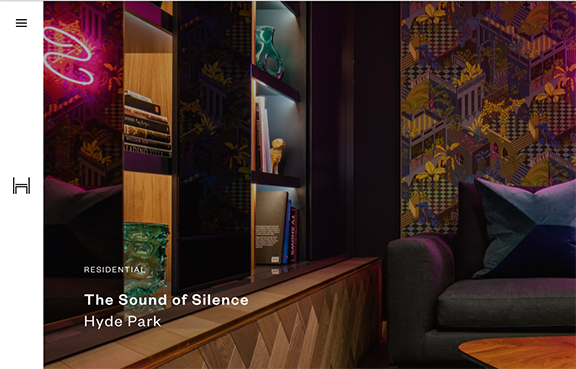
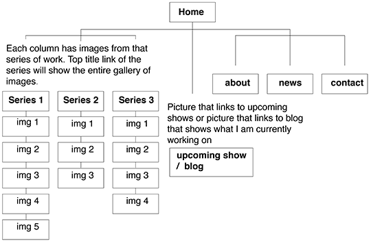
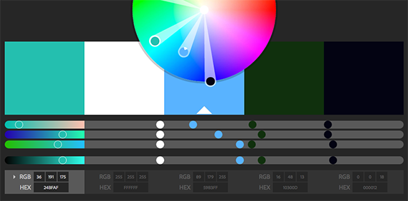
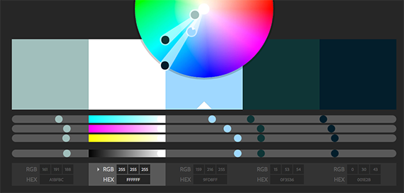
My goal for this site is to create a place where I can show case my portfolio of art. I want my audience to easily navagate through my work and get a since of who I am. I want the quality of work to reclect in the attention to details I will implument into the desgn of my site. The colors I’ll use will be gallery like, clean, minumalistic and somewhat colorless. In order to make the art the main focus.
SCREEN SHOTS
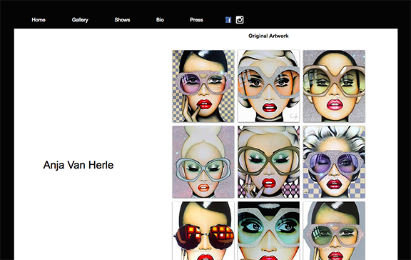
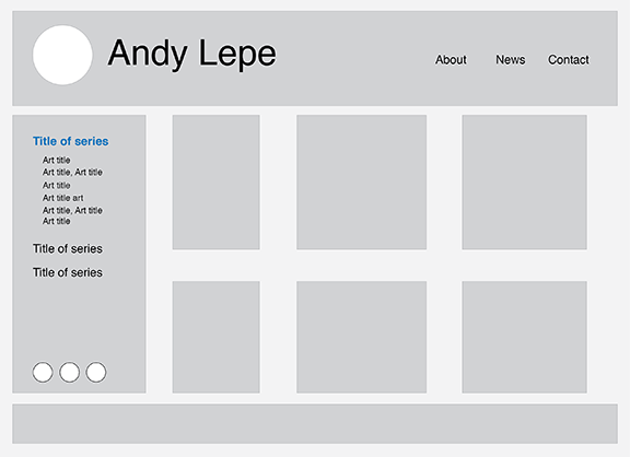
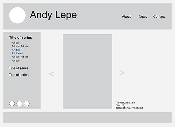
I like the simple clean grid of images on the right side column and the hover of the mouse that shows title, medium and size. I also like the pop up lightbox window that shows a larger detailed view of the thumbnail image.
